Message from Eric
2019 Messages from Eric:
Eric shares his expertise and insights into watercolor painting to help you grow as an artist and find your own style. He will happily address any of your questions and talk about his own experiences gained since he started on this journey over 30 years ago.
A new article is published every month. You can also sign up to receive MESSAGE FROM ERIC as part of our Artists Newsletter HERE.
If you have a question that you would like Eric to answer, just send it to wiegardtwatercolors@gmail.com with “Message from Eric” in the subject line.
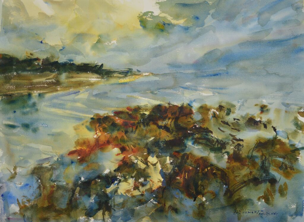
January 2019
Dear Eric,
I enjoy your loose Watercolors as I find them visually exciting. I emulate what you are doing and am trying to incorporate some of your design techniques from your video series into my paintings. However, as much as I appreciate what you are doing, I do not see many paintings- even the abstract ones- in the national shows with your loose style. Why is that? Ken from Oregon
Ken,
That is a very good question and I have frequently wondered the same. In part, it may be due to the fact, that pulling off a powerfully loose painting is not as easy as it may first appear. It takes years of practice, decisiveness, an understanding of design and a mature grasp of the medium.
I think there may also be a second reason. I would venture to guess the majority of the acclaimed artists in today’s watercolor competitions are those who have developed their skills in the commercial world, and then have changed careers or retired to enter the fine art market. The commercial design companies can provide a skill set and discipline, let alone an income, that is enviable. I find those artists have a high degree of control of the medium and an exactitude that can be very appealing; however, the looseness and power of suggestion that I so aspire to do not appear to be qualities encouraged in commercial design firms- with an easily understood reason: they are about selling a product, not paintings.
It is not an easy thing to start out one’s career as a fine artist and so, understandably, many have chosen to work in commercial design firms. The disciplines are easily transferred into the fine art world- at times a detriment because they can so predominantly influence an erroneous view of what quality painting should be, and at other times have positively brought a host of well-disciplined and refined artists into the fine art world.
So, if you want to paint loosely, do so! If done with a strong design set, your paintings will be as individual as you are – and set you apart from a predominantly tight painting world.
Keep your brush wet!
Eric
February 2019
Recently I was in an engaging conversation with one of my virtual critique students and I struggled with how to push him into a more aggressive color statement. Rather than furthering a discussion of technique that is outlined in my books and videos, I thought of a different approach:
I suggested that he paint in two values only. Shove everything into a dark or light value. Naturally, if something is in shadow- even a white object- it would be relegated to the dark value. (This is not an elementary exercise; for the most part this is the way I think when I do my paintings. I then will tease in a few additional values within the two large value masses to “round out” the painting.)
By working in two values it only stands to reason that the shapes will be larger- a dark car will be joined to a dark bush, a white house shape will be joined to a light sky.
Aggressive color is much easier to attain with larger shapes- it encourages a boldness with a saturated large brush that can be difficult while executing smaller separated shapes.
So, for aggressive color statements, try limiting your values to only two. I think you might be surprised at the results.
Keep your brush wet,
Eric
May 2019
Eric,
I have such a hard time finishing my paintings. I get halfway through them and they look so ugly I abandon them. What do you think my problem is?
– Ruth from Spokane
Ruth,
Those who try my method of painting need to exercise the discipline of waiting before seeing results that have a degree of finish. My shapes are loosely constructed in the beginning. Unfortunately, a process that has a degree of finish from the beginning may provide psychological comfort during the process, but a painterly look usually suffers.
I prefer to block in my largest masses and refine as I come to the finish line. It all tends to snap together at the end. My suggestion for you is to work through the uncomfortable “unfinished “ stage of the painting through to completion. You have nothing to lose. I especially would encourage you to do so if your light pattern is still intact- once the light pattern is gone, then the painting is probably also. I generally leave my light pattern the white of the paper and tone it with color at the end, if I need to.
So press forward with your painting until it is complete, ruined, or you don’t have anything else to say. Most of my paintings don’t come together until the very end.
Keep your brush wet,
Eric
June 2019
Eric,
It seems to me there are some pretty nice synthetic brushes on the market now. Have you experimented with them, and what is your opinion?
– Carol in Seattle
Carol,
Yes, I have noticed a few attractive- looking synthetic brushes. At first glance they appear to be made of a natural hair until I try them out, and then I realize they are synthetic. It seems like the brush makers are getting more skilled at trying to duplicate the unsurpassed water carrying capacity of a natural hair brush, but are not there yet and probably never will be. I feel the natural hair brushes are the better value for several reasons:
The better synthetic brushes are priced close to a comparable natural brush; therefore, there is no price advantage with a synthetic.
A good natural hair brush still has a larger water carrying capacity than a synthetic.
Natural hair brushes splay out more uniformly for painting texture, as in foliage or grass. The synthetics tend not to stay splayed, and undesirably snap back to a point.
I think the brush world is still some distance from duplicating the beauty and function of a natural hair brush.
Keep your brush wet!
Eric
July 2019
Eric,
You have stated the importance of constructing a painting with a visually pleasing design; that is, one with an interesting shape construction and simplified value structure. My question is: how do I know when I have achieved that?
– Jean in Washington
Jean,
That is a very good question that I spent much time considering. It may seem that my answer just doesn’t give enough guidance, and that I am speaking in broad generalities, yet I still feel it is the best answer. Otherwise, we are relegated to innumerable “rules” which can be successfully violated by an artist with modest talent. Even though “rules” may be based on an element of truth, they are to be held very loosely.
I think painting is much like cooking: it would be unwise to dump all the spices into every prepared dish; yet we do that when we paint by the “spice rack of rules” that bruise the creative process. What an awful way to paint!
What is the better way? I think if you can think in broad generalities you will progress faster and also have more fun. Think in terms of grouping and forming simplified value patterns that are easy to read from a distance (not in a “rule” of how much real estate each value should cover), shapes that are puzzle pieces and not geometric shapes; avoid tangents and repetitive shapes of the same size, and employ fresh color. Catch the viewer’s eye at a distance, carry it throughout the picture plane, and bring it to an area of dominance. This is not exhaustive, but it gives you the idea to think in big terms.
I think the quickest and most efficient way of seeing these important relationships in your painting is to associate yourself with someone who paints well and is able to point out strengths and weaknesses in terms of these broad concepts. This is how I learned at the Academy. In time, your sense of design will strengthen, without having to adhere to time consuming and frivolous rules.
So many times I have read about another “rule”, only to step away and be glad to have enough knowledge not take it too seriously; sometimes I feel I could never make my paintings adhere to such a “rule”.
Painting is not easy, but the most important concepts are easy to understand.
I believe it was Derain who said, “The problem with art is there is too much information.” I agree wholeheartedly!
Keep your brush wet!
Eric
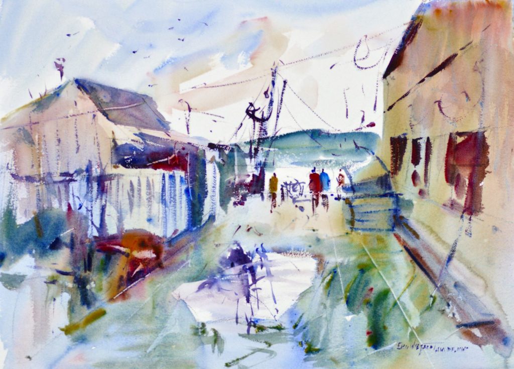
August 2019
Eric,
I notice you do several plein air classes. What do you do if it rains?
– Jane in New York
Jane,
I have wondered the same thing as I was beginning to teach my plein air classes. Last month, during my plein air class in my hometown, I had a chance to work through that little dilemma. Quite frankly, it really did work in our favor.
Even though I have rarely had more than a brief rain shower, I still find it a good idea to have a back up plan just in case the heavens do break forth. Fortunately we had a stand-by studio reserved.
The first two days of class we had glorious weather for painting – slightly overcast and warm. (I like overcast days – I can set up my easel anywhere without the glaring sun on my paper and palette.) The rain drove us indoors on the last half of the second day.
The next two days in the studio were ideal; we worked from our previous days’ sketches and produced some wonderful larger pieces. It was a great exercise in learning to work from our minds and not a photograph. I think many of the students were very pleased with what they could produce from their own minds. It turned out to be a great confidence booster. They learned of the wonderful freedom from the tyranny of reality!
In a very important way, the rain showed them what they could do if they trusted their instincts along with their sketch, and not a photo reference.
Keep your brush wet!
Eric
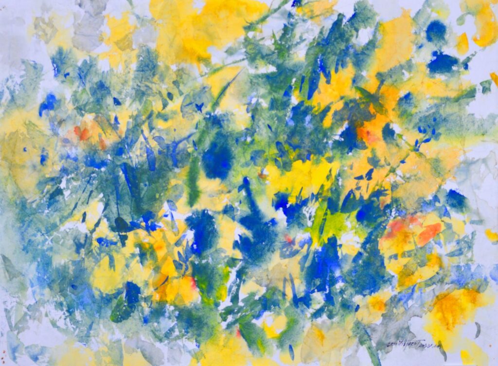
September 2019
Design Shapes
Anyone who has taken a workshop of mine or watched one of my videos will note that I repeatedly mention the importance of good shape construction. No painting will have a strong composition without this consideration.
In my workshops I emphasize the avoidance of awkward geometric
shapes: rectangles, squares, circles, triangles – anything out of geometry class – and focus on constructing the better shapes of puzzle pieces. Puzzle pieces have irregularities that our minds find appealing; whereas, geometry class shapes can convey a visual discomfort – the uniformity of parallel sides and a line of symmetry down the middle make us feel uneasy.
I also encourage the repetition of shapes, but to alternate the pattern to create interest. A good example of this would be pickets of a fence. Even though realistically they are even spaced, the same color, and the same width, it would be advisable to break up the repetition with alternation – group a few, change the value of some, change the distances between the pickets. For those who feel the burden of trying to paint their subject “as is”, this may be difficult. However, remember a good painting is based on understanding design concepts over the natural world as we see it.
But why does the human mind need a breaking up of visual patterns so that they do not appear repetitive or geometric? Why do we need the softer image of a variety of puzzle-pieced shapes, rather than a very static, repetitive construction? What is it in our psyche that requires this?
I am not sure I can answer this, but it is evident in all the arts – our minds demand variety. n music, we need a variety of notes, a variety of timing, and a variety of the spaces between notes. Nobody wants to listen to a steady drumbeat for long.
In writing, look at the variety of sentence structure in your favorite novel – phrases, clauses, short sentences, long sentences. A good plot with a variety of sentence structure is very appealing. A dictionary and many textbooks are not.
So really, when one thinks about it, design concepts are really built upon the knowledge of what we naturally find appealing, on a visceral level. We are hard- wired to appreciate variety, and a good artist will capitalize on this.
Keep your brush wet!
Eric
October 2019
A CONSERVATION OF VALUES
We artists love to show form, or volume of an object, because it gives the
viewer a sense of realism. However, in order to do this, we need to show a
change in value for a three dimensional look- as the form turns away from
the light, it gets darker.
But the problem is that with each change in value, there is also a new
shape made (values determine the boundaries of shapes) and too many
shapes in a painting will destroy it’s solidity. The painting needs to catch
the viewers’ eyes form a distance, and the way to do that is to simplify the
shape construction.
So here is the rub: the artist wishes to show volume, but how to do it without
a change in value? There are two ways I know of:
Focus on the outside edge of the shape to carry the character of the object, and minimize the details within the shape. A flat mass of trees with a careful consideration of what the edge looks like, along with the proper value
of the tree mass, will usually suffice. The outline of a cube with a flat value will probably do enough to tell the viewer that it is a cube.
The second way to show form, or volume without a value shift, is by utilizing a color shift. Cool colors recede, so a form can be show to turn simply by making a shift to a cooler color. I believe one artist told me that the artist can make a form turn up to 40 degrees just simply by shifting to a cooler color. I see this utilized more in figure painting- many times to make a thigh turn or a nose to appear in shadow- but it works for landscapes and all other subject matter as well.
It wasn’t until the era of Modern Art- Impressionists and Post- Impressionists, Nabis, and Fauve painters – that this concept of limited value shifts for a stronger visual appeal was capitalized. (It is funny that Modern Art is now actually considered a traditional era of classical painting. It was a very good time- the best- when concepts of design were articulated and woven in with the classical painting of their forefathers).
My painting process, in order to conserve my values, is that I generally start in large flat patterns – I focus on getting the large shapes right – and reserve the detail, which usually entails showing form, until the end; and this is reserved for the Area of Dominance. The contrast can be very effective and give eye-catching power to
the Area of Dominance.
Keep your brush wet!
Eric
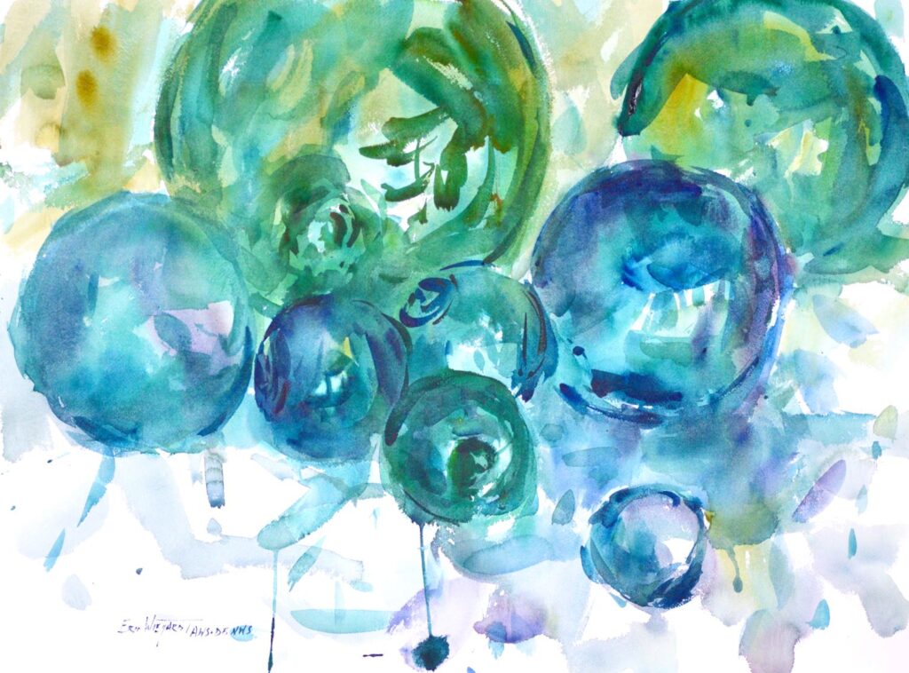
November 2019
TRY SOMETHING NEW
Have you ever wished you could try something new, but felt afraid that it may take you from your usual — and accepted— painting style, or that it may not be well received by your adoring audience? Don’t be afraid. It may be just what you need to improve on your existing body of work.
I have had this experience in the last year and a half where I chose to
delve into the abstract painting world. After many years of painting in a representational style, I felt a need to break away from the demands of the subject matter – the mental and exhausting pull it exacts from my creative process, especially as I finish up a painting – and express myself more freely. Hence, my Tidepoint series began. I found this series of paintings opened up a confidence in my intuitive responses – that they are correct and can be trusted.
It was totally liberating – I could concentrate on design alone and was not encumbered by the demands of my subject. However, I wondered if I would ever return to representational painting, and feared to some degree, that indeed I wouldn’t go back. As always, the artist who makes a living at his or her creativity wonders if collectors can accept the change and growth that individual must nurture.
Recently I have delved back into some representational subject matter as I taught a workshop in Spain. I was surprised to find that I had an increased ability to trust my intuitive impulses, which in many cases varied from what I actually saw.
A higher level of creativity was coming forth, and in so doing, I found the process much more enjoyable. I wasn’t feeling, or even allowing, the dictatorial demands of my subject matter as before. I was allowing my intuitive responses to reign. A sense of freedom, a higher level of interpretation, was being realized. What joy this is!
I think Degas has addressed this well:
“Only when he no longer knows what he is doing does the painter do good things.”
All because I took a diversion and tried something totally new!
Keep your brush wet!
Eric
December 2019
Broken Color or Flat Color?
Recently, after a demonstration of my broken (under-mixed) color technique , a student asked if it would be appropriate to paint with flat washes of color, as she knew an artist who did so.
Yes, it is appropriate if one desires to have a flat color, with no variation of colors juxtaposed in the wash. However, there can be several problems with this:
1). This can be a tedious method. Little pools of flat color mixtures need to be made separately from each other. This can be a distraction from what is happening on the paper and any creative impulses.
2). This technique of over-mixing can also lead to over-stroking on the
paper which will result in a muddy color.
3). If one wishes to paint this way, a wash must only be stroked while it is very wet. If the paint starts to set up or dry, continued stroking will lead to a muddy look.
4). It’s hard to get the rich darks that I so enjoy of fresh, broken color with this technique.
5). This method does not lend itself to the endless variety of stroke quality intrinsic to watercolor on damp paper. It lends itself more towards a stained glass look-lots of singular color statements in a mosaic fashion. This usually results in a high-keyed painting with not many expressive darks.
6). This method is reminiscent of the traditional English method, and many times harden pigment or cake pans of watercolor are used. It can produce a delicate look that watercolor is known for, good or bad.
My method of aggressive broken color is considered an American method. By using moist pigment I’m able to achieve a rainbow of color, juxtaposed to each other to create a new color sensation- brought to us by the Impressionists. The variety of pigments is allowed to mix on its own on the slanted watercolor board. The strokes can be much more aggressive and expressive.
My video, Color Mixing, illustrates very well my color mixing technique.
Keep your brush wet!
Eric