Message from Eric
2021 Messages from Eric:
Eric shares his expertise and insights into watercolor painting to help you grow as an artist and find your own style. He will happily address any of your questions and talk about his own experiences gained since he started on this journey over 30 years ago.
A new article is published every month. You can also sign up to receive MESSAGE FROM ERIC as part of our Artists Newsletter HERE.
If you have a question that you would like Eric to answer, just send it to wiegardtwatercolors@gmail.com with “Message from Eric” in the subject line.
January 2021
WHERE THE COLOR LIES
I have written about this topic at least once before. Because of its importance and the frequency of questions about it from my Zoom mentoring students, it bears repeating.
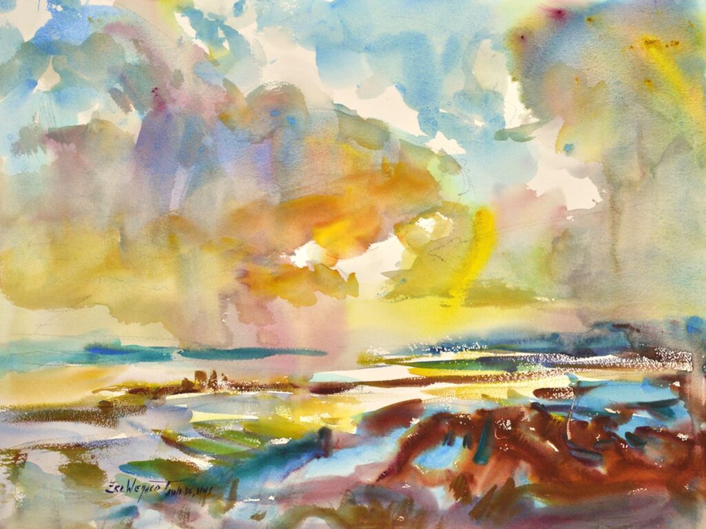
I tend to make my mid-tone shapes the larger shapes in my paintings because the color – and I like lots of it – lies in the mid-tones as opposed to the darks or lights.
The lights can be just tints or the white of the paper and the darks are limited in color because lighter, more vibrant colors such as yellows are left out. With the mid-tones being the larger shapes, the painting will be more colorful.
Also, I like to begin my paintings with the largest shapes – this is called blocking in – so it is quite natural to begin with the mid-tones.
Usually in the initial wash of the mid-tones I will try to establish a dark somewhere in the painting so I have a dark value to compare my mid-tones against.
Mid-tones are a favorite way for me to start a painting; I get a lot of color established soon and a quick block-in established.
Keep your brush wet,
Eric
February 2021
SQUIRREL MOP BRUSH: MAKING IT BEHAVE
The squirrel mop brush is the most used brush in my quiver. Yet when I was in art school I wondered why anybody would use it. It’s floppy and therefore hard to control when used like a traditional round. However, when used correctly, it is masterful.
The squirrel mop’s beauty is that it holds a tremendous amount of water, and therefore, it unloads juicy washes of color almost effortlessly. I always have moist pigment, fresh from the tube—or if it is several days old, it still needs to be of the same consistency—or else the brush will not pick up adequate amounts of the pigment with its soft hairs. Unlike a sable or a synthetic brush it does not have the stiffness to penetrate sticky, let alone hardened, pigment.
I have found that students in my Zoom Mentoring classes have some difficulty in achieving dark washes with the squirrel mop. It will work great for the darks; the key is to extract most of the water from the brush prior to loading it with pigment. Otherwise the resulting wash of color will likely be a mid-tone.
To achieve a rich dark loading of the brush, first rinse out the brush from the previous application and then unload the bristles’ water on a sponge. I vigorously wipe the brush back and forth several times while pushing the bristles firmly against the sponge, to achieve the desired dampness I want in the bristles. It will take some practice to get a feel for this. Then I load up the brush with the fresh pigment, do a swipe on the palette, and if I need a bit more dampness, I may touch the brush to the water.
Students have a tendency to have too much water in the squirrel mop when trying to load the dark pigments. Get most of the water out first. Then, after loading the brush with pigment, add back in a small amount of water, if needed.
Keep your brush wet,
Eric
March 2021
A SECRET TO STRENGTHENING YOUR DESIGN
As artists, we know that the outline of an object gives it its identity. The outside edge of an evergreen tree triggers the brain to recognize it as a tree without having to understand all the detail and form. The outline gives the main clue as to what the object is. Value plays a part here too, but not to the same degree as the outside edge.
Similarly, a cube can be recognized as a cube even if it is painted all in one value; no three-dimensional aspect is indicated, there are no value shifts. In my terminology, it is painted “flat.”
However, if that cube is near the Area of Dominance, it is a good idea to give it form in order to catch the viewer’s eye. If we assign each plane of the cube a different value, the cube looks three dimensional. With each value shift assigned to each plane on that cube, a new shape is made. (I am using the term “shape” in its abstract sense; don’t confuse a shape with an object.)
There is another important design concept at work here: The principle of Conservation of Values, which simply means to limit the number of values in your painting. This keeps the painting from becoming cluttered. Having a limited number of values in a painting strengthens it.
By limiting the values in a painting, we necessarily limit the number of shapes. In our cube example, we may combine the two sides of the cube into one value. Thus, a new single shape is created from those two sides. Limiting the number of values and limiting the number of shapes are flip sides of the same coin.
So, when painting the cube, if it is near my Area of Dominance, I may render the form completely and show all the value shifts. The three-dimensional aspect of it will draw the viewer’s attention. But if I am painting another of the same type of cube further away from the Area of Dominance, I may use only two values, so as not to compete in visual strength with the first cube. Another cube towards the periphery of the painting may be painted in just one value. The view will still recognize it as a cube by its outline.
Strengthen your design by limiting the value shifts, and consequently, the number of shapes, as you move away from the Area of Dominance.
Keep your brush wet,
Eric
April 2021
COMPOSITION: ONLINE MENTORING, PAINT-ALONGS, WORKSHOPS, AND INDIVIDUAL CRITIQUES
Since COVID upended our game plan a year ago, we have expanded our teaching to include several different online options. This has turned out to be a silver lining for us as we probably would not have considered it before 2020.
Composition, as well as technique, is covered extensively:
ZOOM WEEKLY MENTORING CLASSES: This has given me a wonderful opportunity to work with students on a long-term basis. The focus is on composition. These classes meet weekly and there are three sessions available: Wednesdays at 4:30 pm, Saturdays at 8:45 am (wait list) and Saturdays at 10:30 am.
All levels of expertise are welcome. This is proving to be a wonderful experience for the students and for me. I am hearing comments such as:
“I am getting a college education in composition.” “I feel like painting again.” “Painting is fun now.” “I am in a gallery and have sold some paintings!”
ZOOM PAINT-ALONGS: Once a month I conduct a three hour paint-along. The students will complete a painting in those three hours. It is a good and fun way to get an introduction to my instruction.
ZOOM WORKSHOPS: This is much like the traditional workshops I have taught for years, except its online. This offers a concentrated three or four day study, which allows plenty of time for students to practice the concepts and techniques presented.
ZOOM VIRTUAL CRITIQUE: This extended critique is offered to individuals who desire one-on-one time with me. I will evaluate a set of the student’s paintings and set out a path for growth.
I hope you can join us on Zoom.
Keep your brush wet,
Eric
May 2021
A GOOD WAY TO SIMPLIFY YOUR PAINTINGS
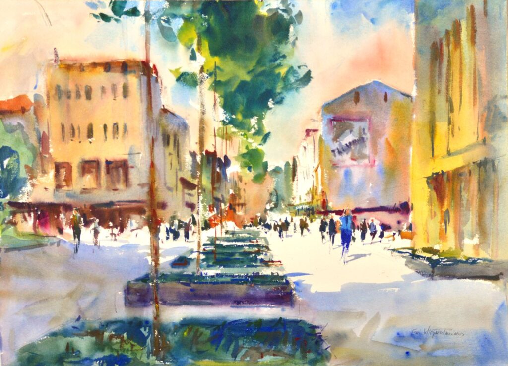
One easy way to clean up a value pattern—especially if the subject is complicated, such as a street scene—is to reduce it to two values. This is not as easy as it sounds, because complex subjects have a wide range of values, and it is often hard to determine whether an object falls into the mid-tones or the lights. For example, what value is a black car that’s in the light? Do you make it a light value, or is it a darker value because the car is black?
The answer is to change our thinking by focusing only on light and shadow. Whatever is in the light, leave at a light value – regardless of whether it’s a dark object such as the car, or a light object such as a white house. If we sort all of the objects according to whether they’re in light or shadow, and paint them accordingly, our paintings will be greatly simplified.
For added interest I will tease in some darks, but I focus on a simplified value pattern by only considering what the light is hitting and what’s in shadow.
Keep your brush wet,
Eric
June 2021
HILLS, VALLEYS AND LONG PLATEAUS
Progress in our painting is not just one nice easy ride up a hill of continuous, steady improvement. Rather, it is excitement fueled by welcome improvement, interspersed with what seems like no progress, possibly even some regression.
This is all part of the painting process. We need to keep in mind that as long as we are painting we will most likely see improvement in the long run. Some regression or stepping back is expected when stretching ourselves in interpretation or technique.
What I have the most difficulty with, though, are the long plateaus. Sometimes it seems like instead of moving forward or back, I’m just in a holding pattern. I have learned these periods are really launching points for further development. Eventually new ideas do surface – a lot of times from the most seemingly insignificant periods of development. So as discomforting as some of these plateaus may be — and they can seem to go on for quite a while — they are also periods of staging for new fertile ideas that refine our paintings. And then the hill of development and marked improvement starts all over.
We all like to have the excitement of the hills of creative development, but it’s just not possible or desirable. We also need the valleys and plateaus to further our creative expression.
Keep your brush wet,
Eric
July 2021
SEE THE BIG RELATIONSHIPS
It is important to see the big relationships when painting. The big ideas hold the painting together; the details are embellishments. Relationships of large value masses to each other—the lights against the darks, the darks against the mid tones—are the backbone of the painting, much like the armature that holds a sculptor’s clay upright. Without this underlying structure the painting fails.
The painting can be structured from realistic value patterns such as those found in nature. Landscape masses huge value shifts between the sky, ground, hills, and trees. (I have a video on this if you want to learn more.) Sometimes, though, we artists prefer to create our own value patterns, assigning values as we see fit to develop our creative vision. Both of these approaches are viable forms of artistic expression; many times I will have a combination of the two in my paintings.
It is important not to let anything—a photo reference, an on-location motif, or a set of design rules—get in the way of seeing an overall pattern of large value relationships.
I think this is one of the few “must have” design concepts for a successful painting.
Keep your brush wet,
Eric
August 2021
AREA OF DOMINANCE
A strong painting requires an area of dominance. There are a number of design tools we can use to direct the viewer’s eye to the area of dominance:
- Strongest value contrasts
- Warmest color
- Most intense color
- Hardest edges
- Line
- Detail
- Largest Shape
- Animation (especially the human figure)
- Placement near the center
Most of my students are familiar with the above, but may forget to play the flip side of the coin outside the area of dominance:
- Softer edges
- Less detail
- Grayer colors
Harder edges, detail, and intense colors in the area of dominance mean little unless contrasted with softer edges, less detail, and grayer colors outside the area of dominance.
These design tools are like the piano keyboard: the combinations are endless. Only a few, or all of the elements can be used. They can be mixed and matched. It is fun to put what is usually assigned to the area of dominance–a warm color, for example–and place it outside. Then use another element–animation–to bring the eye back.
Once, I painted a street scene with two figures near the center, incorporating strong value contrasts and hard edges. Because these elements made such a strong area of dominance, I was able to use all my intense reds outside of it.
Conversely, one can take an element that is normally used outside and place it in the area of dominance. I saw a very effective painting in which the area of dominance was void of detail and soft-edged. But because of its placement near the center and the strong value contrasts, the eye was drawn in.
Don’t make a formula of it. Have fun and experiment!
Keep your brush wet,
Eric
September 2021
PAINTING THROUGH BOUNDARIES
Having too many small shapes tends to make our paintings look fractured. We can avoid this by constructing a few large shapes to build our painting upon. As artists, we can create our own conceptual shapes by painting through the boundaries between adjacent objects. Constructing these new shape patterns will help us achieve a bold, free look.
For example, if our subject includes a tree next to the roof of a house, we could render them as two separate objects: the parallelogram of the roof next to the circle of the tree’s foliage–an awkward juxtaposition of two strong geometric shapes. But a much better and more satisfying choice would be to combine the two shapes into one, with no edge separating them. The mind’s eye will simply fill in the edges of the tree and roof. Making this subconscious transition from artist-created abstract shapes to perceived reality is engaging and stimulating for the viewer.
And such soft, or “lost,” edges are easy to work with in watercolor. They can always be tightened up later with a harder edge superimposed over the top to create a beautiful painterly look. In contrast, especially in watercolor, it is difficult to soften a hard edge without resorting to scrubbing and lifting.
I try to combine objects to create a new shape for each of the values in my painting: lights, mid-tones, and darks. Sometimes this means I will need to shift the value of an object slightly so that it matches more closely the value of an adjoining object for easier combining.
Painting through the boundaries of your objects creates a sense of reflected color, and hence, natural light. Back to our example: the green wash of the tree mixing with the red of the roof, all done in one wash, will give this a bounced-light effect.
It can feel uncomfortable to paint through the boundaries between objects, and the painting may look out of control until the end of the process when detail is finally added to achieve the finished look. It may take a leap of faith to see it through to the finish, but the result can be well worth the effort.
Keep your brush wet,
Eric
October 2021
COLOR MIXING
Here are some key points from one of the most appreciated demonstrations in my workshops:
Be sure to squeeze plenty of paint onto the palette. My paintings improved dramatically at the Academy when I took my instructor’s advice and stopped trying to economize on paint.
The paint should have the consistency of sour cream so I can grab multiple colors on my brush easily. Once it starts to feel like toothpaste, I squeeze out fresh on top of the old. Many of today’s paints are made to stay moist longer, and by squirting a little water or throwing a damp sponge into a covered palette at the end of the day, the paint can last several days.
To draw the excess water out of my brush I use a natural cellulose sponge.
I like to stack colors on top of each other with the dampened brush, and then do only one figure eight on the palette before applying to the paper. This allows the color to be “broken” or unmixed, creating a scintillating look, as the Impressionists have taught us.
I only use natural-hair brushes that carry plenty of water and pigment. I also use the biggest possible brushes for the job, in order to avoid over-stroking with a small, inadequate brush.
Oftentimes after doing the figure eight stroke I will pick up more water from my reservoir and then drive the bristles uphill on my palette, which is propped at an angle. I want the brush to be as loaded as possible.
One of the least recognized tools for effective color mixing is the value study. When I have a plan, then I can apply paint with confidence, which leads to fresh color statements.
For those who would like to delve further into this topic, you may enjoy the second video in my Painting Loosely series, which is on special this month. See below for details.
Keep your brush wet,
Eric
November 2021
LOOK FOR THE LIGHT IN THE SHADOWS
To show sunlight in a painting, we need strong value contrasts representing the change from light to shadow. But it is easy to go too far and push the value so dark that the feeling of sunlight is negated.
A black, dead shadow can look more like a black hole in our painting than a shadow. Shadows really do have color in them! Step into one along a busy street or in a park and you’ll see.
In photos, shadows are all the same dark lifeless gray. The camera simply cannot read the color in the shadows.
In painting, I have found it very helpful to keep my light pattern very light. This allows my mid-tones to be on the lighter side, and the same with my darks.
Creating a lighter dark allows for ample use of reds and yellows, along with a variation of blues. You will find that the colors in the shadows have life now. The feeling of reflected light in the shadows makes the painting look like it is filled with sunlight.
Look to the shadows for your light!
If you would like to learn more about this topic, check out the third DVD in my Painting Loosely series, Color in Shadows.
Keep your brush wet,
Eric
December 2021
OUR FAVORITE TIME OF YEAR
It’s our favorite time of the year! The rush of summer visitors is past, we’re back to winter hours at the gallery, razor clamming season is upon us, and best of all, we’re looking forward to family gatherings during the Christmas season.
We are blessed to have three grandchildren born last year, and another on its way, due in May. After a few challenging years, it is wonderful to see our children having children of their own. We try to help, do a little coaching, but refrain from giving advice–unless they ask!
We have had another great year at the gallery. The pandemic forced us to try something new–teaching online classes–that has now become a mainstay of our business. As much as I have enjoyed all the travel over the years, being able to spend more time at home is a welcome change. I thought Ann and I would sail off into our twilight years traveling and teaching workshops, and we will still do some traveling workshops in the future, but on a more limited basis than we did before.
One of my favorite quotes is by renowned American painter Edward Hopper. He said, “The artist’s life is the best life, if you can get through the first 40 years.” Well, we are set to begin our 37th year here at Wiegardt Studio Gallery. (The original name was Potrimpos Gallery, after the German bark that ran aground near Ocean Park back in 1896. People had difficulty with that name–I was asked if we sell pots here. Hence the name change to something more marketable.) As to the 40 years referred to by Mr. Hopper, I’ve accumulated enough years of painting now that I think I am finally getting it!
Many thanks to all of those who have purchased my paintings over the years. Pandemic restrictions brought some changes there, too, with more people feeling comfortable purchasing my originals online. Ann and I have always been grateful to have my paintings hanging in collectors’ homes, and may we never take it for granted.
This Christmas season we celebrate the birth of Jesus. Our journey through this art business has truly been a journey of learning to trust God. He has been so faithful. May you know His peace during this time of year and may your homes be filled with family, friends, and delightful memories.
Eric & Ann