Message from Eric
2020 Messages from Eric:
Eric shares his expertise and insights into watercolor painting to help you grow as an artist and find your own style. He will happily address any of your questions and talk about his own experiences gained since he started on this journey over 30 years ago.
A new article is published every month. You can also sign up to receive MESSAGE FROM ERIC as part of our Artists Newsletter HERE.
If you have a question that you would like Eric to answer, just send it to wiegardtwatercolors@gmail.com with “Message from Eric” in the subject line.
January 2020
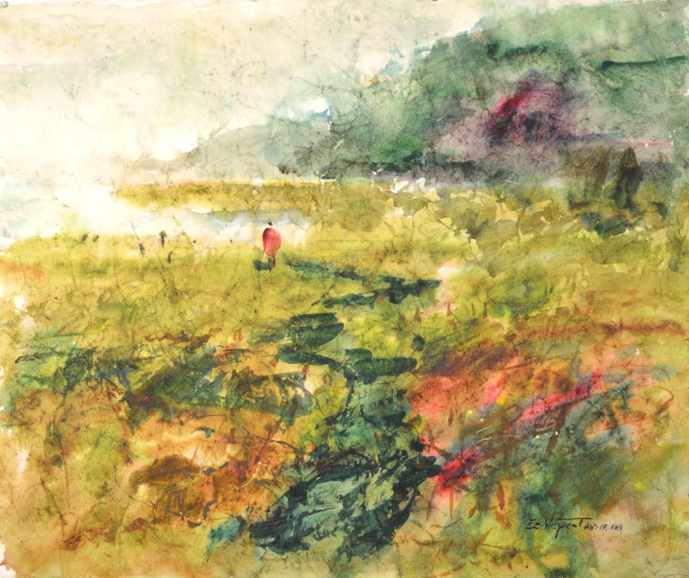
WHAT IS AERIAL PERSPECTIVE?
Aerial perspective is a natural phenomena — something that happens
in nature. Even though a painting isn’t entirely dependent upon natural
effects, in fact, it is preferable that it does not mimic nature, we artists draw
upon principles of natural phenomena.
As objects recede from our vantage point, they become lighter in value and
bluer in color. I believe it is because the yellow light spectrum drops out
first with the blue rays remaining. This is most evident when standing on an
elevated plane and viewing successive hillsides as they recede from our
vantage point. Of course, this is easy to do in the Pacific Northwest.
As in all painting, we artist draw from nature for inspiration, but we are not
beholden to it. I’ve seen many beautiful paintings where aerial perspective
is not taken into consideration.
The only exception that I know of where this principle does not apply is in clouds. The white of the cloud tends to get warmer as it recedes from the viewer. The same probably applies to snow, but not having been around
that much snow, I’m not sure. Nature always throws in some funny twists.
I was asked in a recent class if aerial perspective applies to other than landscapes, such as a still life set up. I am not aware of it being considered in such a way, but I don’t see anything wrong with it, and possibly it could
work.
Keep your brush wet!
Eric
February 2020
WHAT TO DO WITH THAT BAD STROKE
I have recently become more aware of how to deal with those troublesome strokes – those shapes that appear on your painting that aren’t quite right. You may, of course, simply “erase” them with a brush of water, or at least soften them, but I have recently started to appreciate them.
Yesterday I had two awkward sky shapes, and my gut feeling was to get rid of them. However, I thought maybe they were really there for a purpose, and I should refrain from any correction at that time. I am glad I did, because I came back later and the strokes that followed on top mitigated the awkwardness; in fact, the troublesome strokes, after the additional strokes were overlaid, were exactly what I needed in that portion of the painting.
In other words, what appear to be erroneous strokes may be exactly what is needed. Our intuitive impulses need to be honored; if the stroke feels right at the time, regardless of how it may first appear, it will most likely be correct.
Keep your brush wet!
Eric
March 2020
I am writing this from my latest workshop in the country of Belize. Ann and
I are discussing future workshop locations and I thought I might share with
you how we determine them. We have several criteria that we feel need to
be fulfilled:
Painting scenes of the local culture is comfortably and safely accessible
with minimal distractions, preferably right outside the door of our lodging.
This gives the students an opportunity to have a break in their room,
should they want to, on a painting day.
We generally schedule several days off, so we appreciate a lodging location
that offers plenty of cultural experiences: restaurants, shopping, and
sometimes excursions.
Our lodging needs to be safe, clean, and moderately priced. We also
choose a location that has the opportunity for several other painting locations within a 45 minute taxi or bus ride.
So as tempted we may be to look at resorts, they generally do not offer us the painting material of the local culture without a bus trip. They are also expensive.
So as you can see, we put a lot of time and energy into finding locations that we think will give our students the best painting and cultural experience.
Come join us in Switzerland, September of 2020, or in Belize in January 2021!
Keep your brush wet!
Eric
April 2020
THE ELEPHANT IN THE ROOM
Earlier this year I had the pleasure of traveling to Houston and picking out the award winners for an international show: WASH (Watercolor Art Society of Houston). I selected the show online several months previously and in conjunction with the final awards judging I conducted a week long workshop.
The workshop attendees were a delight and the new friendships made it very special. Southern hospitality and grace were displayed freely
.
One afternoon I took the workshop attendees to the show and shared my award selection process. I think some of the students were surprised that some of the more realistic paintings, while getting into the show, were not award winners; and that some of what may appear to be less refined were selected instead.
Painting is never meant to be a replication. It is an interpretation of life before the artist. An understanding of design is paramount, and unfortunately, many realistic paintings lack this time honored discipline. Also, subject matter and a refined technique can hide a lack of design discipline to an uneducated eye. A superficial technique can easily be accepted through the influence of commercialism and the media.
The unknowing public can easily be fooled that a painting copied from a photograph represents reality.
So as I select award winners, I am looking for those artists who have the courage to paint with an appreciation of design concepts, even though their work may appear somewhat less refined than others. I am looking for artists willing to take risks to more deeply express themselves, over a slavish replication.
Paintings that hint of copying a photo— by hand, by a projection process, or a computerized digital interpretation—will have points taken away in my judging process. I want to see the artist’s interpretation, not a cameras’ or a computers’.
I want to honor those who are using their own sense of design, but I also want to even the playing field between those who draw freehand and those whose refined paintings are a projection of an image on the watercolor paper, traced and filled in. (This is the Elephant in the Room few competing artists want to talk about. Many influential artists come from a commercial background where projection is widely accepted — time is money!)
Some may interpret this to mean I don’t appreciate realism and detail in painting. On the contrary I do, but I want to see it well done with an appreciation for design and with freehand drawing.
I think it is possibly time to have an international show where no mechanical devices are allowed in the painting process. It may be time to even the playing field. I believe the great watercolorist Milford Zornes felt the same way. However, it would have to be on the honor system, and that could be problematic.
Keep your brush wet!
– Eric
June 2020
SOFT EDGES — THE SECRET WEAPON
Consider all the “Rules of Composition”— the do’s and do nots — and ask yourself: why are they labeled as such? In many cases it’s because they are to keep us from creating a riveting visual discomfort: the viewers’ eyes will not be able to travel throughout the picture plane. But, if I violate a “Rule”, is it possible to mitigate the negative fallout from it, and still find the violation acceptable in an otherwise good composition? The answer is yes, and one of the most effective tools in our arsenal is the soft edge.
Consider the following do nots:
Horizon Line bisecting the picture plane.
Two trees in parallel rather than three.
A line going out to the corner of the picture plane.
Awkward geometric shapes such as square, triangle, circle, parallelogram.
Shapes in tangent.
There are others; so many that one can suffer from paralysis by analysis.
One of the best solutions is an effective incorporation of the soft edge. Soft edges allow the viewers eye to pass through an area without being arrested by an awkward passage.
So consider making one side of a pair of trees soft edged, allow the horizon line to drift off into the sky at a point away from the area of dominance, let the building meet the sidewalk with a soft edge as it comes to the corner of the painting, and allow the corner of a parallelogram roof drift off into the trees.
Hold “Rules” loosely in your hands; one of your most effective tools to violate them is the soft edge.
Keep your brush wet!
– Eric
July 2020
THE BIGGEST VALUE JUMP
By the laws of nature, the biggest value jump is between the
sunlight and shade. Smaller value shifts are generally found within
the light area and the shadow area. Also, sunlight is such a huge
determining factor in values that we can safely say that almost
anything – there are always exceptions – in the sunlight is lighter
in value than any object in the shadow regardless of local color and
value. A black asphalt road will still be a light value in the sunlight.
This is important to know from a Design point of view, because nothing destroys a painting more quickly than too many value shifts. The temptation is to add excessive detail for a sense of realism in our paintings, but in the process, we can easily muddle our values. A simplified value structure of two values: light and dark – determined by sunlight and shadow – with some less prominent halftones teased in can provide much needed strength to our paintings. All good artists must simplify the value patterns they observe from life. This is one great way to do it.
Keep your brush wet!
Eric
August 2020
THE COLOR OF GREY
One of the greatest opportunities for rich color is in our greys. It is important to understand that a greyed color does not have to be a lifeless Crayola grey; the term “grey” simply means that a color is not a primary or secondary color. It can, and probably should, have beautiful mixes of colors within it.
In the greyer portions of your painting, allow the complimentary colors to mix on their own so the resulting color is interesting and not lifeless. Bands of warm and cool colors should be evident in your greyed mixtures.
Unfortunately, photographs are not helpful on this. Most shadows are a flat grey and the deeper shadows are the same, but darker in value. Stay away from that color. Bring light to your paintings by allowing your greyed mixtures to be exciting complimentary mixes. Your painting will benefit greatly.
Keep your brush wet,
Eric
September 2020
SHIFTING VALUES
The mantra for outdoor painters—those who paint from life and are trying to capture a sense of reality—is to squint and see the value relationships. Squint, squint, squint is what we are told.
But are the values really a constant? Or do they shift according to the viewer’s line of sight and therefore there are no true values?
Even though I do find it very helpful to squint while painting on location to see large value relationships, I would still propose to you that there really is no true value of any object. Sound funny? Let me give you an example:
Look at the grey-weathered telephone pole that has a dark mass of bushes behind its base. Squint at the base. Notice how the pole appears lighter than the bushes. I would probably paint it with a light mid-tone in such a scene.
Now look up at the top of the pole and squint. The pole appears dark against the sky, and in such a scene I would paint it a dark value. But keep in mind this is the same pole with logically the same value throughout its length and yet it is perceived as two different values at two different spots. The reason: Our irises open and close according to the amount of light, much like the aperture of a camera, and values are perceived variably. So value is really a matter of perception and not of reality.
The conclusion I draw out of this: Stop worrying about getting the “right value” of an object, it really can’t be done. It is better to focus on an overall pleasing interpretation of values.
Keep your brush wet,
Eric
October 2020
OVERCOMING MUDDY DARKS
I enjoy adding dark tones to my paintings as they make the painting “pop” – the contrast in value with the mid tones can really add life to your painting. Traditional watercolor painting suggests that to achieve darks, layer the mid-tones over the lights, and then the darks over the mid-tones. This will create a nice harmony throughout the rest of the painting because transparency allows the successive layers of color to come through.
However, there is a problem with successive layers of color, especially when dealing with dark values: Darks can get muddy quickly. After about three washes of color, the darks lose their transparency and quickly attain a flat, muddy look. This is especially true with poor brush handling or over stroking.
If your darks tend to get muddy, try applying them directly onto the white of the paper. When applying mid-tones and entering a passage that will eventually be a dark, consider transitioning seamlessly into the darks at that point, rather than running the mid-tone wash through and applying the dark wash later.
Think about keeping your darks fresh and lively by putting them directly on the white of the paper.
Keep your brush wet,
Eric
November 2020
OVERCOMING MUDDY DARKS
I enjoy adding dark tones to my paintings as they make the painting “pop” – the contrast in value with the mid tones can really add life to your painting. Traditional watercolor painting suggests that to achieve darks, layer the mid-tones over the lights, and then the darks over the mid-tones. This will create a nice harmony throughout the rest of the painting because transparency allows the successive layers of color to come through.
However, there is a problem with successive layers of color, especially when dealing with dark values: Darks can get muddy quickly. After about three washes of color, the darks lose their transparency and quickly attain a flat, muddy look. This is especially true with poor brush handling or over stroking.
If your darks tend to get muddy, try applying them directly onto the white of the paper. When applying mid-tones and entering a passage that will eventually be a dark, consider transitioning seamlessly into the darks at that point, rather than running the mid-tone wash through and applying the dark wash later.
Think about keeping your darks fresh and lively by putting them directly on the white of the paper.
Keep your brush wet,
Eric
December 2020
FINISHING A PAINTING
Last week in my Zoom class, a student mentioned that she is able to construct most of the painting to her satisfaction, but the last bit needed to complete the painting eludes her. She is running a nice race, but the stretch to the finish line is difficult and she tends to stumble over herself.
I offered suggestions, but missed a key point. Looking for a few hard edges and interesting shapes of detain around the Area of Dominance is certainly effective in making that part of the painting “pop.” What I failed to mention was: Look for the answer in the painting not the reference. The painting will tell you what it needs. At this juncture the reference should be set aside and the total focus should be on the painting. It is important to keep thinking in terms of what needs to be done to strengthen the design. Only after the decision has been made should the artist look at the reference to borrow some information. This is true whether working outdoors or from a reference photo.
A true fine artist will allow concepts of design to rule over an image of reality.
I will hold a painting up to a mirror at this point and ask if it 1) catches my eye from a distance, 2) carries my eye throughout the picture plane, and 3) brings my eye to an Area of Dominance—and does it hold it there as long as possible? This is not a formula, but in time one gets the feel for it. It is especially helpful to have the proper mentoring. This is the most efficient way I know of creating an effective composition, and it’s the way I was taught in art school. (I am very thankful my mind was not cluttered with pointless theories.)
A mirror is invaluable because it reverses the painting so I can see mistakes and sets it a distance from me so I can more easily evaluate the above objectives.
All of us here at Wiegardt Studio Gallery wish you a Merry Christmas and God’s blessings to you and your family.
Keep your brush wet,
Eric