Message from Eric
2022 Messages from Eric:
Eric shares his expertise and insights into watercolor painting to help you grow as an artist and find your own style. He will happily address any of your questions and talk about his own experiences gained since he started on this journey over 30 years ago.
A new article is published every month. You can also sign up to receive MESSAGE FROM ERIC as part of our Artists Newsletter HERE.
If you have a question that you would like Eric to answer, just send it to wiegardtwatercolors@gmail.com with “Message from Eric” in the subject line.
January 2022
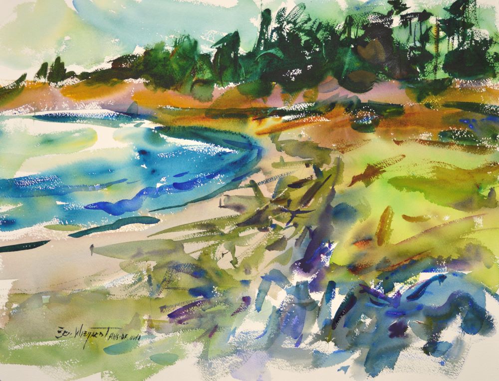
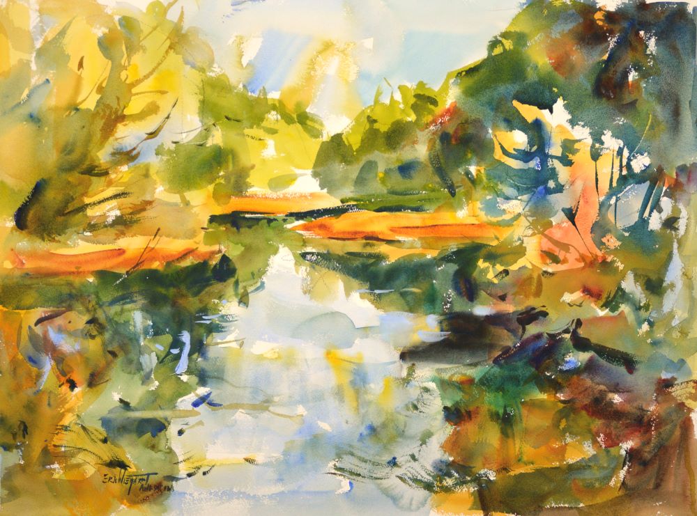
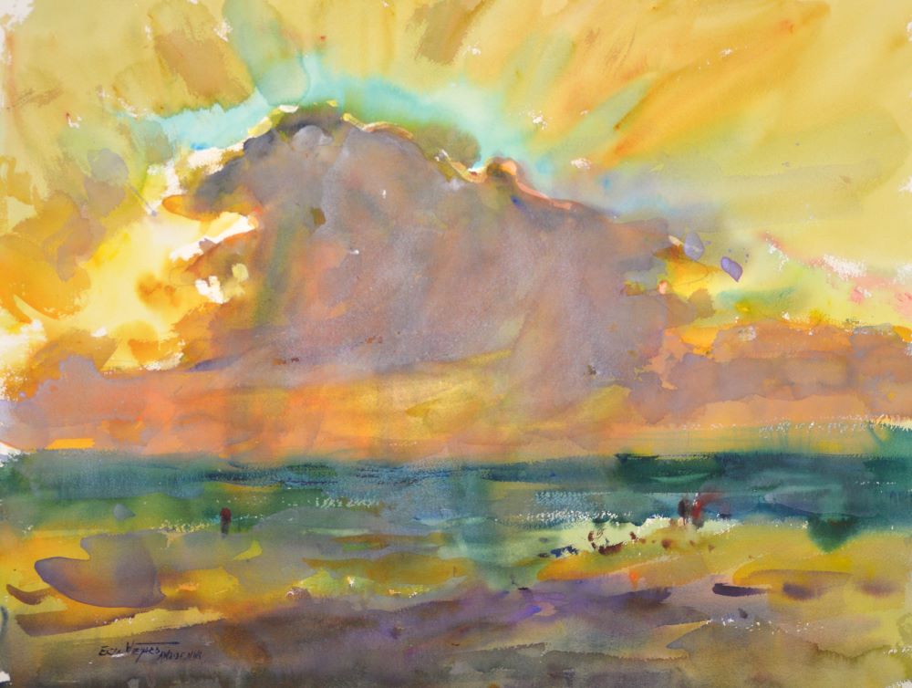
LANDSCAPE VALUE DISTRIBUTION
In photographs, the lights are often overexposed so that the ground and sky plane will appear to be the same value, or the darks are underexposed and reveal no reflected color, only blackness. Understanding the proper value relationships of the planes in a landscape can help you overcome the shortcomings of your reference photos.
In most cases the landscape can be divided into four planes: sky, ground, hill, and trees. In order to preserve their distinct identities, each of these needs to be assigned a different value.
If the sun is overhead, the mass with the lightest value is the sky, regardless of whether it’s sunny or overcast. The second lightest value will be assigned to the ground plane because it receives the full impact of the light source from directly overhead. In order for the ground to appear flat and below the sky, the ground must be a darker value than the sky.
The third value is assigned to hills, because an inclined plane does not receive the overhead sun rays as directly as a horizontal plane. The fourth and darkest value is reserved for vertical objects, as they are in shadow and receive reflected light off the ground.
This value distribution—not the details in the painting—is what makes the sky go overhead, the ground lie flat, the hills incline, and the trees and buildings appear vertical.
There are many variations of this model. For example, when the sun is low in the sky, verticals will receive the most light and consequently would be the lightest value mass. Sand, snow, or sometimes water, may be as light or lighter than the sky, as they are highly reflective.
The important thing to remember is that in order to paint a realistic landscape, the value masses need to be in the right relationship to each other.
The fourth DVD in my Painting Loosely from Photographs series, Landscape Theory, covers this topic in depth. It’s on special this month. Check out all of our January Store Specials.
Keep your brush wet,
Eric
February 2022
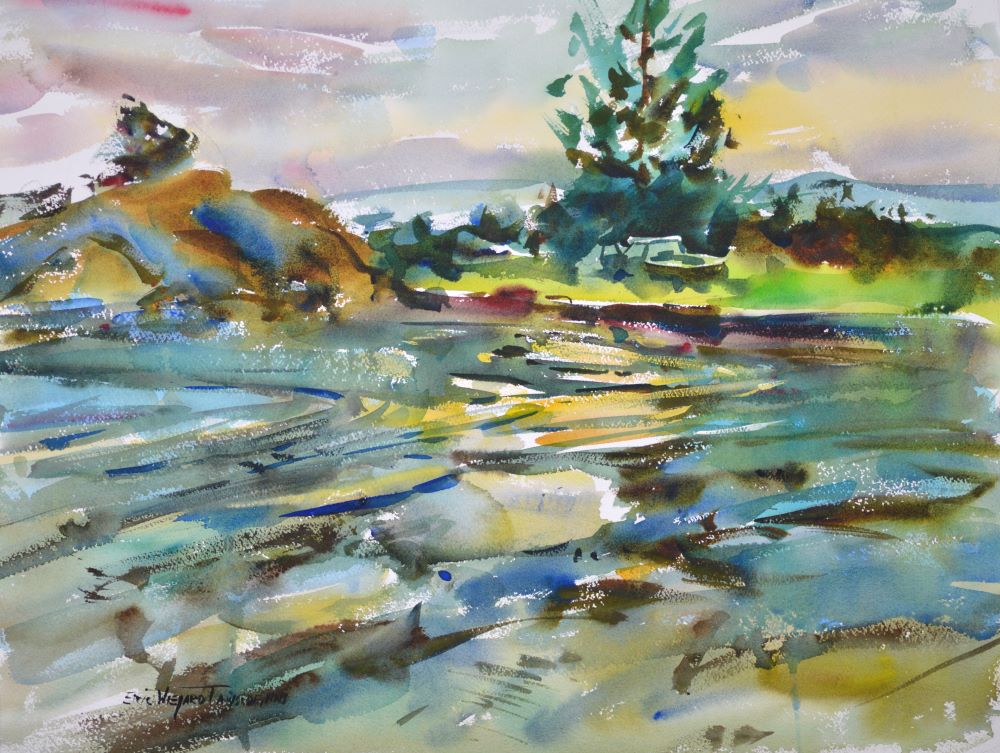
FOCUSING ON OUTSIDE EDGE SHAPES
Detail is rarely the answer to our painting challenges.
Years ago, while teaching a plein air workshop in Florida, I learned an important lesson. I was right in the middle of a painting demonstration, trying to paint some palm trees. I was struggling with this unfamiliar subject, until I realized: The character of an object is best conveyed by the careful construction of the outside edge of the shape, not by the interior detail.
Try indicating your subject using a simple flat wash and just a suggestion of texture and detail. You can then complete the picture using bold, fluid brush statements within the shape for a loose effect. Or render the interior with more detail for more definition.
The fifth DVD in my Painting Loosely from Photographs series, Outside Edge Shapes, covers this topic in depth. Check it out in our website store.
Keep your brush wet,
Eric
March 2022
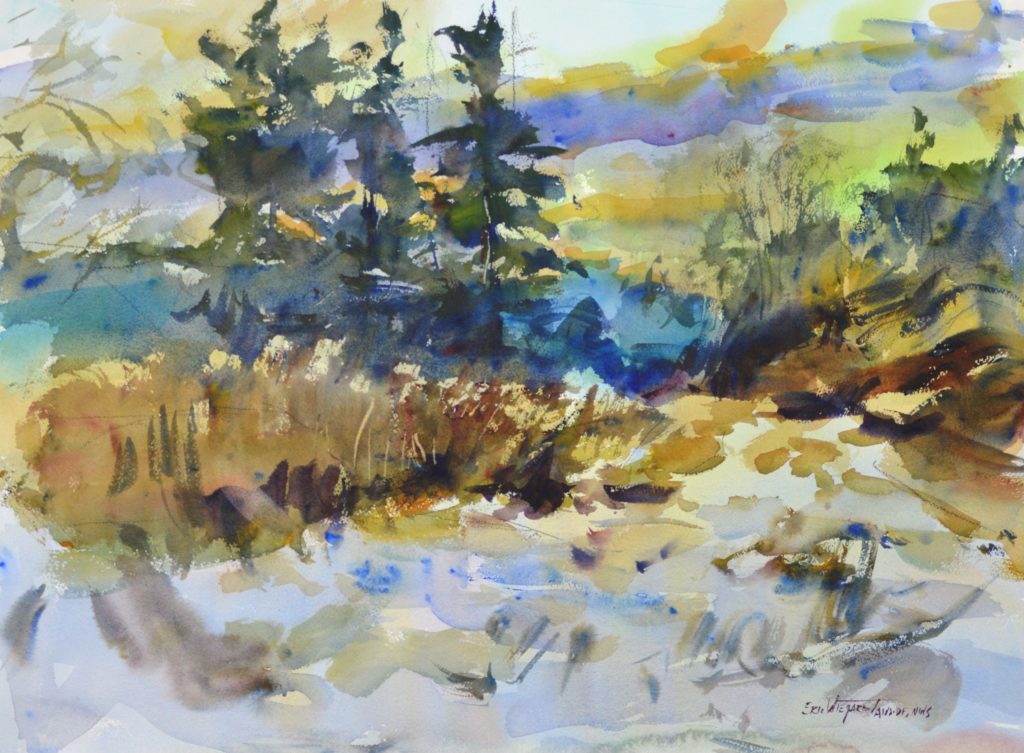
CREATING AN AREA OF DOMINANCE
One of the key elements of a good composition is the area of dominance—the part of the painting that draws and holds the viewer’s attention. The artist achieves this by constructing sharper value contrasts, more intense color, warmer colors, harder edges, and more detail in that focal area. So far, so good. But the flip side of this concept is that the other areas of the painting must be softer, more muted, less detailed. Otherwise, there will not be sufficient contrast for the area of dominance to stand out.
Keep in mind that in watercolor, it is much easier to start with soft edges, tightening them up later as needed, rather than the other way around. I start with soft edges throughout. Then toward the end of the painting session, I create hard edges in my area of dominance and progressively construct fewer and fewer as I move to the outside of the picture plane.
Let your area of dominance make a more powerful statement by simply backing off on the rest of your painting.
Refer to DVD #6 in my Painting Loosely from Photographs series for further exploration of this topic.
Keep your brush wet,
Eric
May 2022
HOW TO PAINT LOOSELY—THE VALUE OF A SKETCHBOOK
Sometimes the practicalities of life pull me away from painting for a while. When that happens, I have found that keeping an active sketchbook is an excellent way to keep my right brain engaged. It makes the transition back into the creative process much easier.
I suggest trying a variety of tools for sketching. I find the big clutch pencils with a Nero lead a pleasure to draw with. Once you find a tool that suits you, you’re much more likely to pick it up and use it.
Next time you have some downtime at the airport–or anywhere–pull out your sketchbook and your favorite drawing utensil. Casual sketching is a relaxing way to pass the time. Your confidence will grow as your drawing skills improve, and you will be “in the zone” when it comes time to pick up a paintbrush again.
Keep your brush wet,
Eric
June 2022
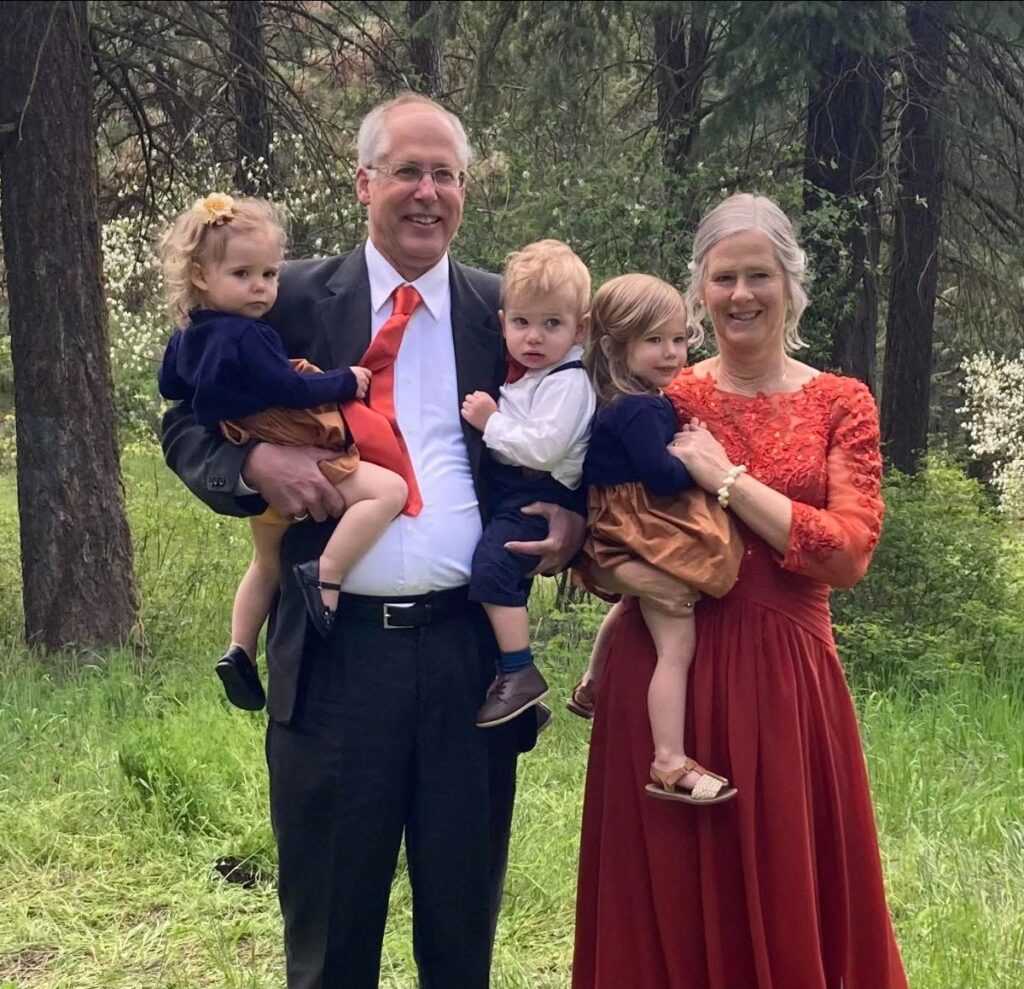
KELLY’S WEDDING
On May 13, our eldest daughter, Kelly, married John Thompson in a ceremony in Spokane. Kelly is a speech therapist and John is finishing up his last year at The Master’s Seminary in California.
Our youngest daughter, Esther, was the matron of honor. Their bouquets were a lovely warm mix of orange and gold, created by their uncle, my brother Todd. The reception hall decorations featured tabletop arrangements of tall wild grasses.
The wedding went well; nobody got sick or fainted. The flower girls–our little granddaughters Naomi and Lizzy–made their way down the aisle without assistance. Not to be outdone, Benji, the ringbearer, sprinted down the aisle–without falling!
During the reception, Eric was called upon to show his dance moves. He did not disappoint, and fortunately, there was a talent scout among the guests. Regretfully, Eric has now resigned from watercolor painting. We have moved to New York where Eric is lining up a slate of Broadway shows he plans to grace with his performance. His schedule will be especially tight as he has also agreed to show some of those moves on Good Morning America.
It’s not a gift–it’s a calling!
Truly, it is a great comfort to us as parents to see all four of our children happily married!
Chears,
Eric & Ann
P.S. from Eric: Our daughters looked beautiful, the grandchildren were adorable, but the mother of the bride was absolutely stunning in her lovely coral gown!
July 2022
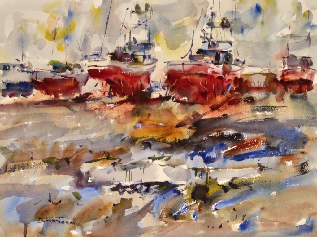
COMBINING SHAPES
Painting loosely doesn’t simply mean doing what comes naturally. Done well, it requires following some important principles. One of these is the idea of combining two adjacent shapes of similar value into one larger, more interesting shape–something that looks more like a puzzle piece than a simple geometric shape. When painting a boat, for example, I don’t separate the dark hull from its dark reflection. Instead, I paint through the waterline and create one new shape with no separation. These big shapes allow for passages of flowing color and bold brushwork. The effect of reflected color is an additional benefit of this approach. And the soft edges created are easy to tighten up later with a firm stroke, if desired.
My books and videos elaborate on each of the key design concepts behind painting loosely. My weekly Zoom mentoring classes focus on principles of composition as well. May you find these tools helpful as you continue on your artistic journey.
Keep your brush wet,
Eric
August 2022
JUDGING AN ART SHOW
I’ve been invited to be a judge on the selection committee for the American Watercolor Society’s 2023 International Exhibition. My fellow judges and I will be choosing which of the many entries will be accepted into this prestigious show. Ann and I will be traveling to New York in January for this event.
I was an awards judge for this show in 2014 and won the AWS Gold Medal of Honor in 2012 for The Duck Hunter, a painting of my dad by the shore of Willapa Bay.
Here are the things I look for when judging:
First, the painting should hold up well at a distance. It should grab your attention when you enter the room.
Second, the artist should demonstrate mastery of the inherent characteristics of the medium. Are there nuances of color mixing and edge quality that are only possible in watercolor?
Third, good design is a must, but the painting should go beyond technical excellence to reflect the artist’s imagination and creativity. Photo realism is not the goal.
This process has served me well in the many shows I have judged over the years. I hope this encourages you on your way to entering shows. Why not get your feet wet in our Online Student Show this fall? Details coming soon.
Keep your brush wet,
Eric
September 2022
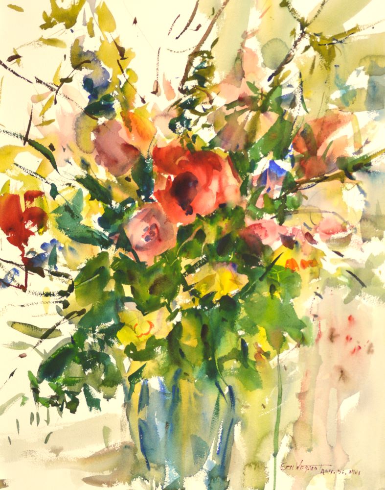
COLOR MIXING TECHNIQUES
The first principle of effective use of color is to squeeze more paint than you think you’ll need onto your palette. Throwing away expensive paint at the
end of your session may go against the grain, but it is preferable to throwing away your work.
Your paint should have the consistency of sour cream. This allows you to easily pick up multiple colors on your brush. Once the paint starts to feel more like
toothpaste, it’s time to squeeze out some fresh paint on top of the old. If you squirt a little water or throw a damp sponge into your palette before closing it at the end of the day, that paint can last several days.
I will stack colors on top of each other with the brush, and then do only one figure eight or letter s on my palette before applying paint to paper. This allows the color to be “broken” or unmixed. The juxtaposition of thin bands of color creates an appealing, Impressionistic look. After that initial stroke of unmixed color, oftentimes I will load up my brush with water and go back and scoop up the remains of the figure eight or s to apply to my paper.
I hope you find this brief introduction to color mixing techniques useful. If you would like to learn more, a good place to start is with my color mixing video. I cover this topic in more depth in my weekly online mentoring class.
Keep your brush wet,
Eric
October 2022
PAINTING LIGHT AND SHADOWS
In nature, a warm light casts cool shadows; cool light will cast warm shadows. Many artists adhere to this rule in their painting. Following this approach too literally can stifle creativity, but there is an important design idea that flows from it.
The juxtaposition of complementary colors energizes a painting. I like to force colors into the shadow from the opposite side of the color wheel than those chosen for the area that’s in light. I don’t necessarily keep my colors realistic, but I do try to keep them fresh and not overmixed.
Good paintings are based on little lies.
Keep your brush wet,
Eric
P.S. My DVD Color in Shadows covers this topic in detail.
November 2022
WHAT MAKES A MASTER?
“A picture is first of all a product of the imagination of the artist; it must never be a copy. If then two or three natural accents can be added, obviously no harm can be done. The air we see in the paintings of the Masters is never the air we breathe.” –Edgar Degas
Every good painting needs a lie. Documentation of reality makes for a poor painting. Strict adherence to a photo reference contributes to this problem, but the same can be true when painting plein air.
But we go too far the other way if we reject the wisdom of the past and simply express ourselves. A painting that is full of imagination, but lacking in discipline, is no more pleasing to the eye than an overly realistic one.
When I judge a show, it is a real pleasure to view the work of artists who have learned to express their ideas while adhering to timeless principles of design.
Keep your brush wet,
Eric
December 2022

THE CHRISTMAS LETTER
It’s been another productive year for the Wiegardt family: One new grandchild added, one coming later this month, and yet another scheduled to arrive by spring!
In other news, Eric has been invited to judge at the American Watercolor Society International Exhibition in New York City in January. It is a real honor, as this one is the “really big show.”
Ann has been busy putting together an exciting lineup of destination plein air workshops for 2023: We are going to Hawaii, Port Townsend, and Switzerland. There will be two workshops in Long Beach, and Eric will be teaching for several watercolor society groups around the country.
We are thankful for the continued success of our Zoom classes, which have been going strong for two and a half years now. Mentoring classes meet each Saturday morning, and once a month we do an online paint along. What started out of necessity during the first year of the pandemic has become a mainstay of our business. Teaching from home frees us a little bit from all the traveling, allowing us to focus on other interests–did we mention all these grandchildren?
After decades of watercolor painting and much exploration, trying numerous styles and interpretations, I believe I have settled into a subject matter and style that is comfortable–and some say unique–to me. We are so grateful for the special friends, collectors, and employees this business has brought us over the years. It is a wonderful way to make a living.
Blessings to all of you this Christmas season as we celebrate the birth
of our Lord and Savior Jesus Christ.
Keep your brush wet,
Eric